Thoughts. Views. Ideas. Thoughts. Views. Ideas. Thoughts. Views. Ideas. Thoughts. Views. Ideas. Thoughts. Views. Ideas. Thoughts.
Photoshop Workshop : Exploring the Creation of a Magazine Cover...
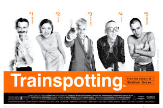
This is our final workshop focusing on photoshop, today we explored different fonts and were set the task of creating out own film magazine cover. Before starting my cover I researched existing Film magazine covers to see what common elements they included, what fonts were favoured and how much information was obtained on a cover. I found a common element was having a main eye catching image as the background, and for most times the image was the main article within the magazine. As a class we discussed the importance of typography, and how the key element for a magazine cover is one that is bold therefore easy to read from a distance. We also discussed how the font can set the ominous of the film when used for a film poster, for example 'Trainspotter' is done in a font which is very bold and simple, and therefore similar to the font that would be used for railway signs, it would not create the right ominous if they had used a font such as Sabon.
The first challenge was trying to think of a name for my magazine (my imagination was not flowing that lesson!), I settled on the name "streamed", I chose this as I wanted my magazine to focus of independent film from up and coming artists and how their work can be streamed from many different sources. For this particular issue, I wanted the main focus to be on film festivals, especially focusing on the Sundance film festival and the winners of the short-film awards. Therefore I chose to have the background image of the directors with their awards, this would not be seen as the typical "norm" background image as many film magazines use the stars or the characters of up and coming films, I chose to do this as firstly I wanted to demonstrate how behind every good film is a great director and also if it was on the shelves I would want it to stand out against other film magazines. I used a different colour for my main title, to my features as to ensure my cover did not appear boring to the audience.
Subscribe to:
Comments (Atom)
